I've been known to equate technical analysis to driving down a windy road and attempting to steer while looking only out the rear view mirrors.....It arguably has some value until an unforeseen news event (Mac Truck) hits you head on at about 85MPH.
That said, there are a couple of chart "patterns" that *seem* to have a higher predictive value than others of future price movements.
The one I'm going to talk about here, as a followup to my post from a couple of days ago is the "Cup and Handle". The first image below is an artists rendering of what would be considered the basics for a cup and handle formation.
The line as it move between A and D is the "cup". E is the bottom of the handle.
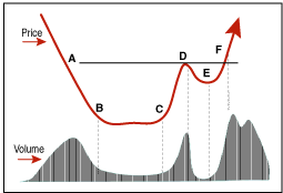
While the first image could likely be called a cup and handle -- especially indicative of a classic cup and handle is the volume dropoff in the bottom of the cup and handle. One way this is described is that the holders of the security are "strong hands" and interested in holding at the given price....not panicking out.
However, some believe that the Cup and Handle is most predictive of future price movements in assets that have already established indentifiable longer term trends...that's funny..."duh", huh?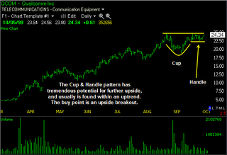
The chart in image two shows the preceding run-up and then the cup being carved, a test of the recent high, a smaller pullback than the previous "cup", and a "retest" of the previous high at the far right of the chart (far right of the handle).
A technician might describe this as a "constructive chart" given that the stock in question had been given enough time to "catch its breath" and let long term holders, new sellers and new buyers reposition themselves.
The theory is, if on the "retest" the stock meaningfully breaks the previous high that shows up as the top of the cup and handle formation, it will attract a lot of attention from momentum players and those that follow such chart setups. The most obvious indication that something like this is underway is a jump in the volume along with the "breakout" to the new high in price as seen in the third chart.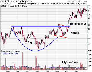
One can argue that with the number of people following these chart formations that they are almost self-fulfilling prophesies. However, it is interesting to point out that before the days of advanced technical analysis, realtime charting, PC's, etc., successful speculators like Jesse Livermore around the turn of *last* century advocated "buying on strength", leveraging up on breakouts, and "selling on weakness....seemingly heresy given the pervasiveness of the "buy low sell high" paradigm.
The fact that speculators buying breakouts amassed great fortunes over 100 years ago, before the widespread popularity of modern charting, seems to argue that it is actually a reflexion of a deeper pattern that imerges within the context of market driven mass psychology, rather than solely the technical analysis tail wagging the greater market dog.
One take on the mass psychology driving such price behaviour might go something like this:
One can imagine a security in a solid uptrend when a bit of news or an important "psychological" price point (like nearing a round number or well-traded option strike price) gives some long term holders the impetus to book some profits.
Once it becomes obvious that the security will not move higher in the immediate term, this selling can accelerate....after a bit of a pullback, the number of those willing to part with the underlying decrease....absent a signifcant piece of news, it is likely the stock will carve along the bottom of the "cup", slowly building support for a higher price.
Speculators who missed the last runup and now see the shares as "cheap" start to take positions...the stock slowly starts climbing towards its recent high, the high marked before pulling down into the "cup".
As the price reaches the previous high, there are a number of holders who are kicking themselves for missing the previous high and watching their paper gains evaporate. In addition, there are some unfortunatey late comers to the party who bought near the top who have been under water and sweating it out.
These are "weak hands" and have likely promised themselves to not be so stupid the next time they get such a gift of a high price, or once they break even (in the case of the late comers).
If the fundamental situation, or news flow has not changed dramatically enough to render the previous resistance irrelevant, the price will likely pull back again once reaching the previous high, thus marking the other side of the cup.
The previous selloff, balancing out of supply and demand, and subsequent runup plays out again...only this time the number of people is fewer than in the previous drawdown and we see the chart form a "handle" to go with the cup.
The shallowness of this drawdown (compared to the cup) means there are fewer anxious owners waiting to sell....As the stock approaches the breakout point for the third time it is like dry tinder waiting for a match.
The "match" could be any positive news or a change in the underlying fundamentals that effect the security or asset in question. The positive news, coupled with the new high garners attention from the media, traders, and technicians who watch for such "breakouts".
The "breakout" becomes a self reinforcing, virtuous circle, until the asset has reached a new higher price.
.......
Ok, so why don't people just buy the bottom of the cup or the handle and get the secuity at a lower price? The "breakout" or even the double top is seldom obvious or definitive until it happens...As easily as an asset could carve out a cup and handle, it could simply roll over....until there is a definitive breakout, the cup and handle could just as well have a NEGATIVE event turn the price action into a triple top.
So you're probably saying, "I'm not a trader, so why all this talk about cups and handles?"
Well, while the cup and handle, driven by mass psychology on the way up, the same psychology, in reverse drives upside down cups and handles or "inverted" cups and handles (sounds like a "top gun" manuever). 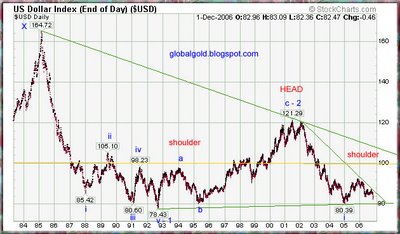
See the chart to the left for a longer term view of the dollar in action.
Here the author is trying to point out a head and shoulder chart formation -- however, the part I'm most interested in is the little shoulder off to the right hand side of the chart.
In the last chart I attempt to "zoom in" on this period, covering the last couple of years. I'm guessing, purely guessing here, that we should see some relief in the slide of the dollar (for a spell) however, if and when it should break the 80.50'ish neck-line (or bottom of the upside down cup and handle) it could well set off a quicker move down.
Of course, like always, you are getting your advice from a bald dog with greyed out eyes and bad teeth over the Internet, so consider the source before acting on it in any way that could damage your financial, mental (or physical!) health.
ciao for now,
fuBarrio


No comments:
Post a Comment